Decisions

It’s time to fish.  No more cutting bait, no more sampling.  I need to get the warp on the loom and woven off so that it’s down to assembly and writing before we head off to pick up the AVL on the 22nd.  That weekend will be gone, so I need to make sure I’m in good shape.

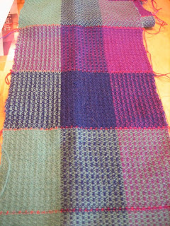
That said, I’ve been looking hard at the gample (see?  new word!) I did this past week and it was absolutely the right thing to do.  My beat was much better and more even (and I’m also reminding myself that a 20″ warp is a different beast than a 9″ warp) and the patterns are now evident in ways they’d not been before.  So, first off, some pictures of each particular treadling/tie-up:

In all versions, the warp color order, from left to right, green-blue-purple.  And, I treadled each version in all three colors, green-blue-purple, before changing the tie-up/treadling pattern.  Squares were 3″ wide by 4″ tall on the loom.  Or as close to that as possible, and woven as a balanced fabric – 30 epi/ 30ppi.

This version has a more distinct horizontal/vertical look – and it also has a waffle-like texture that’s quite different from the other two.

And here’s an example of what I mean about a fabric being “hot”.  That value difference between the light green and either the blue or purple is significant – and the purple/green zinging off of each other really tends to overwhelm the pattern.  Comare the upper left with the lower right – and, most intriguing, the top middle with the lower right.  Neat, huh?

A better look at the waffle-like one – I think either of the two-color versions would work well.  But, I’m 99% sure that this one is the winner:

It has the plaiting effect that Anita wanted, quite strongly, but when viewed from a distance, it doesn’t get too crazy.  And, it’s in line with the Pantone colors that she wanted.  I’ve plenty of both colors to make this happen so no worries on that front.

So, whaddya think?

Posted in Weaving | 1 Comment

Progress

Deadline weaving continues over here – it’s another vest but this time it’s specifically for Handwoven.  I was asked to follow the Pantone “Winter 2013” color palette and I boldly chose a set of three colors from Jaggerspun in the 20/2 Maine Line wool.  I had planned to take a page out of Sara’s book (article) and use two colors that are close in value to get a more interesting warp.  That resulted in choosing a purple and a deep blue.  For the weft, I wanted a high-contrast color and I settled on a very light teal.

Next was some quality time looking at plaited twills from a variety of sources.  This was my Saturday:

A combination of FiberWorks, Olesner, Strickler, a few Handwovens and various other weaving books.  I’m so glad that I have a good library on which to draw – it makes a world of difference.  A few hours later and I’d worked up a series of potential fabrics based on an 8-shaft straight-twill threading.  So, time to wind the warp and get moving.  Lickety-split, I was done weaving on Sunday afternoon and then I washed and finished the fabric.  I’d even tested two different setts so I could be sure of the fabric.

Yeah, I can hear it now.  You’re already saying it to yourself, “What was she THINKING?  Plaited twill?  In THOSE colors?”  Well, Pantone was thinking along those color lines, and in principle it seemed like it could work, but once I got the fabric off the loom … ugh.  Suffice to say that it would be fashionable but most assuredly not something that I wanted to stare at for the next four weeks, much less wear for the next 20 years.  I was pretty despondent on Monday.  So, I got out my calculator and spreadsheet and confirmed that I could squeeze out another sample and still be able to choose any combination of colors I wanted for warp/weft.  I threw on another warp – this time, each color by itself in a wide stripe so that I could do a little gamp.

Smart girl.  Should have done this from the start, and “note to self” in that category, but I’m much, much happier with all these possibilites.

Here’s the whole shebang – and now you can see, perhaps, why I think that greenish blue is just a bit “hot”.

None of the green ones are particularly horrible – and that bit in the lower right corner is woven off with 20/2 silk, you know, for science! – but absolutely not “me”.  And, for something that’s going out into the wild, I think it’s important that it be something that I like and not just something that the customer wants.  Otherwise, what’s the point?

So, the decision now is whether I want to use the purple or the blue as the warp.  The fabrics are distinctly different – and switching them out, warp vs. weft, gives different looks, but all of them are worth going after I think.  Even the monochrome ones are interesting – but they’d be a bear to weave.

Yeah, huge sigh of relief over here.  I’ll make it.  It’ll be tight, and I can’t get distracted, but I’ll make it.  Then again, I’ve got these headbands I’ve been knitting …

Posted in Weaving | 2 Comments